
She looked me in the eyes, grabbed my forearms, and told me I was the spawn of satan.
It was right after I started The Middle Finger Project, and apparently the name choice didn’t go over too well with some folks. Folks from my “real life.” Folks who were in my Facebook feed. Folks who non-ironically used words like “spawn.”
I considered it for a brief moment before dismissing it entirely and moving on to more important things, like the kind of air conditioning bills you’d have in a place like hell. How do these folks afford it? Do they even bother with clothing? I wouldn’t bother with clothing. Which probably means I’d have go on a diet right before I’m about to kick the bucket. I’ll call it The Deathbed Diet. Maybe it’ll catch on.
Anyway, I’ve come to the conclusion that if anybody’s the spawn of the devil, it’s fish. Now there’s a real freak show for you.
Fish! With their creepy beady eyes, taste buds covering their body (?!), a jaw that isn’t even attached to their skull, and the mysterious ability to SUCK THE OXYGEN OUT OF WATER MOLECULES THROUGH SLITTY LITTLE FLAPS IN THEIR ARMPITS, forget the witches: we should have been burning these guys by the stake. Then again, maybe that’s why eat them. Maybe it’s one big covert operation.
I’ve never been a fan of fish.
Ask anybody—in particular, people who have tried to get me to eat fish. They all seem to be under some grand delusion that the only reason I don’t like fish is because I simply haven’t had fish prepared this way. Or this kind of fish. Or dipped in this kind of sauce. Or some combination of all three. But they’re all wrong, because I know exactly why I don’t like fish: It’s disgusting. And yet, fish keeps showing up as a theme throughout my life.
My dad was a fly-fisherman, so my entire childhood he would drag my twelve-year old self into muddy rivers, armed with a pair of oversized waders and this lethal weapon called a rod. You know what kind of damage a 12 year old can do with a really long stick with a hook on the end?
He’d take me to fly fishing exhibitions and torture me with knowledge about the best methods for tying a fly—and don’t let anyone tell you different, young lady.
Fast forward years later, and, as luck would have it, I began dating the owner of a sportfishing company. I know. I KNOW. But I promise it wasn’t one of those Freudian dad things. Or maybe it was?
And a few years after that, one of the biggest fly fishing companies in the world, Winston Rods, contacted me to lead a new branding initiative. I just stared at the computer screen shaking my head with disbelief at the coincidence. Fish love me.
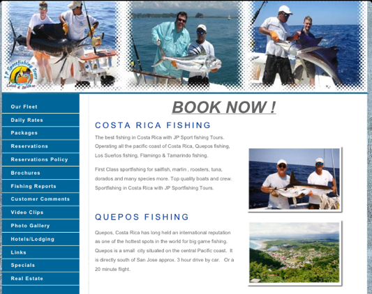
And now, naturally, I’ve been on a project for the last year helping J.P. Sportfishing, the best sport fishing company in Costa Rica, hand its competitors their asses.
As you can see: I CANNOT ESCAPE THESE JERKS.
The fish, that is.
Yet, I have a lot fun working on these types of projects. Fun because they’re industries that aren’t typically online, that aren’t typically tech, that aren’t typically my clients. And it’s exciting as hell to take someone from zero to hero. Especially good, hard-working people who deserve it more than anybody.
When I first took a look at J.P. Sportfishing and performed a number of initial analyses, such as understanding their current market position, analyzing their competitors, doing a linguistic audit (to determine which words might have damaging associations and which words will help us get the message across in a fresh, exciting way), and much more, one thing was abundantly obvious:
Before we could do anything, they needed a website that demonstrated they meant business.
Nobody in town had a decent website, including them. Not from a lack of caring, but from a lack of understanding what a difference it could make. And from the erroneous presumption that, “If this is what everybody else in our industry has, it’s good enough.” Yet, something so simple as a modern-looking website could change everything. The reason I knew this was because I knew their target market: Americans. And I also knew what they’d have to do in order to book a fishing trip: Submit a deposit. And I also know that if your website looks like it can’t be trusted, then nobody’s typing in their credit card numbers—period.
I advised J.P. right out of the gate: Before we do anything, if you even just upgrade to a modern website, you’ll put half your competitors out of business.
And with the help of Colomark, who totally gets this kind of industry, that’s exactly what we did.
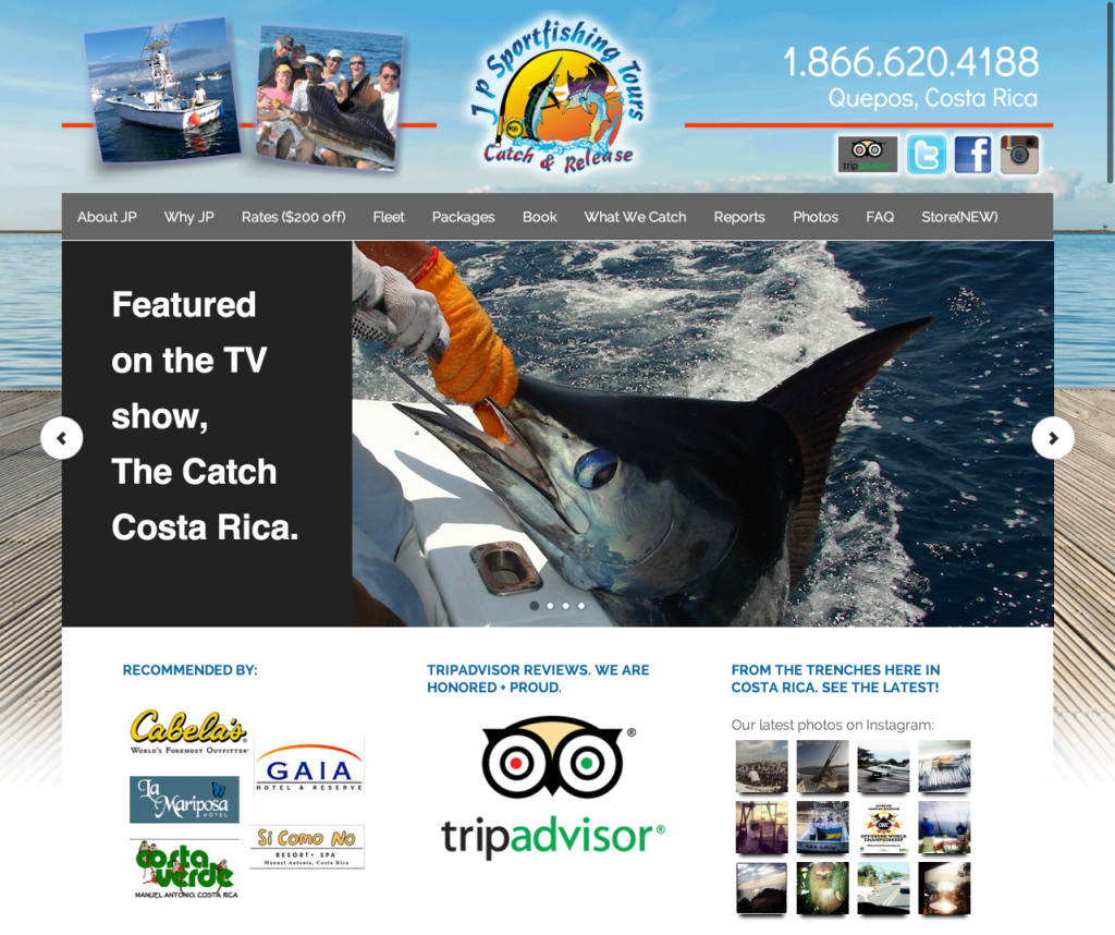
Since that tweak alone, J.P. has gone onto have the most successful fishing season since the year 2001.
I’m also proud to say that this year alone they’ve already done over $350,000 in revenue, with 8 months to go.
And none of this could have been possible if they didn’t take that first leap of faith (and invest the money) to upgrade their website & look like they mean business. Sometimes it really does take money to make money.
But it’s not about show; it’s about inspiring trust in your company. It’s about looking as legit as you actually are. And it’s about getting people excited to do business with you.
While I am not a web designer, nor do I know squat about the technical piece of building websites, I can’t stress the importance of having a legitimate website to represent what you’re selling—whether it’s your jewelry, online therapy, your books, a tour company, or a damn sportfishing company.
And this is why I praise the ground that new company Strikingly walks on.
Strikingly is my new favorite addiction, and I almost didn’t want to tell you about it because it’s that good.
It’s a quick, easy, painless, user-friendly click-and-go website builder that makes setting up a GORGEOUS website a breeze—even for a technophobe. We’re talking drag, drop, write and publish—and deliberately designed so you do not have to know a drop of coding, or HTML, or CSS, or any of that stuff that drives us business owners crazy.
They’re also fantastic for building out landing pages, and I’ve even been using them to build out custom proposals for all of my clients. Think of how much you’re blowing some other dude out of the water when they submit a little Word doc proposal, and you submit a gorgeously designed website with your ideas?
Yet, it takes literally minutes to set up, and that’s why I love these guys. They even have a new website template where you can click one button and it imports your entire Linked-In profile, so now you’ve got a real website to show prospective clients or employers. BAM.
So today’s Just The Tip is this: If you don’t have the funds to do a custom design right now, try Strikingly. Try Strikingly. Try Strikingly.
It’s FREE if you’re just making one site, or only $20/month for the Pro version. (Recommendation: Get the Pro version to remove the Strikingly logo and be able to attach your own custom domain – which you can easily do through them without having to have a host or anything. Bonus recommendation: Pay for the year up front and save $50.)
Then you can screw around with stuff like Facebook pages, blogging, SEO, sales pages, and more.
But whatever you do, don’t put the cart before the horse the fish before the boat.
At best, you won’t go anywhere.
And at worst, that fish is going to look you in the eyes, grab you by the forearm, and accuse you of being the spawn of Satan.
And take it from me: It’s going to be awkward.